
The Beauty of Neutrals: Calm, Timeless, Effortless
Neutral interiors are often described as simple, but when you look closely, they’re anything but. Neutral interiors require restraint in execution and a sense of emotion in how they’re layered, so the space feels intentional rather than empty.
The key is in texture. A neutral palette of whites, creams, and sandy tones can fall flat without it. Add timber with a visible grain, stone with natural variation, or linen with a soft crumple, and suddenly the room feels alive. It’s not about loud colour, but about subtle depth.
Lighting plays a huge role too. Soft, diffused light highlights the warmth of pale timber and creates shadows that add dimension. Japanese interiors often embrace this - low, indirect layered light that makes the space feel calm and grounding rather than stark.
Furniture and layout matter just as much. Clean lines, low profiles, and honest materials keep the focus on form and proportion. A floating timber bench, a simple paper lantern, or a handmade ceramic bowl can be enough to set the tone. Nothing screams for attention, yet every detail has purpose and a reason for being there.
The beauty of a neutral interior is that it’s not trying too hard. It doesn’t date quickly, and it allows you to breathe. It creates a backdrop for everyday life, while still feeling thoughtful and designed.
When done well, neutral design is far from plain. It’s rich in feeling, quiet in mood, and endlessly versatile.
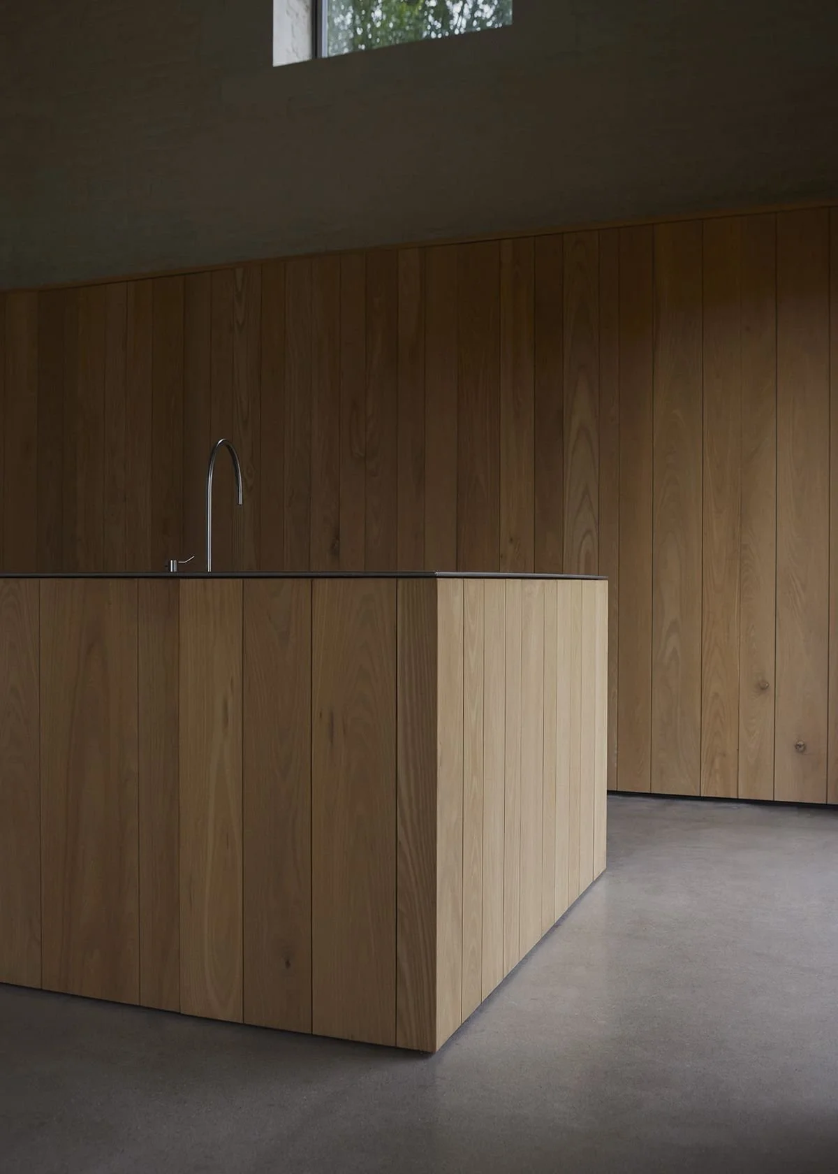
Architect - John Pawson, England

Naples Street House, By Edition Office

Bathroom by Mosh Home, Gold Coast

By Mosh Home

By Mitchel Sweibel Studio

Mount Martha House, By Victoria Merrett Architects