
Burgundy, Burgers and Burl.
Lately I’ve been noticing three things popping up in my design radar: burgundy, burgers, and burl. A funny trio, but each one ties back to the way I think about materials, colour, and how spaces make us feel. Random? Maybe. But they all share one thing - delicious.
Take the East End Treehouse by InForm. It’s a great example of contrast and tonal hues done well - Spotted Gum veneer layered with brick tiles, stainless steel anchoring it all, and that circle skylight pulling light right down into the middle of it all. On their own, these elements could clash. Together, they balance. That tension between warm timber, steel, and subtle curves is what gives the project so much personality.
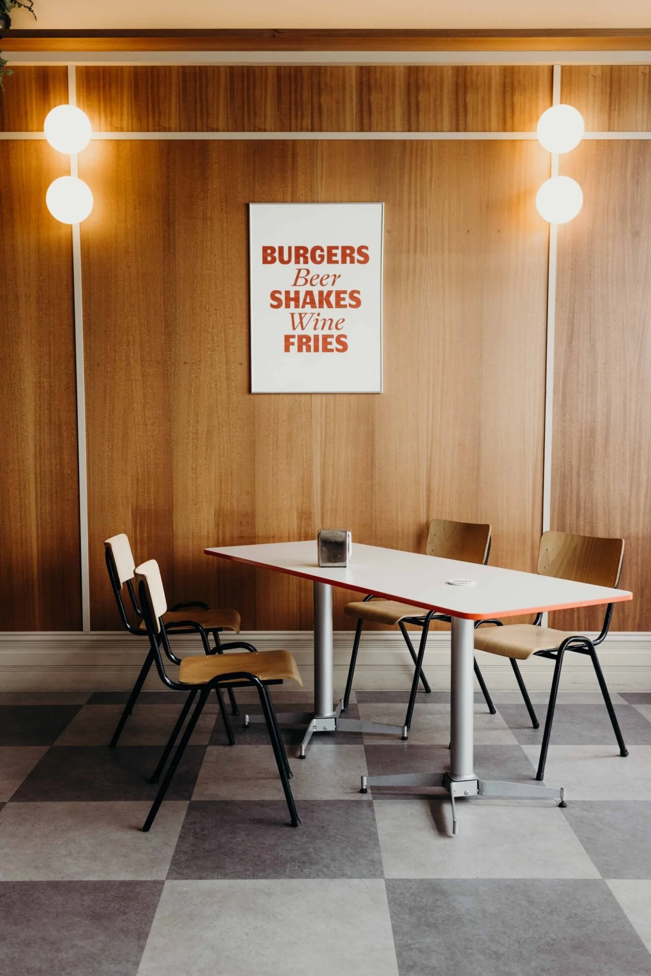
I see the same thing happening in commercial burger fit-outs. The design cues are simple but effective: checkerboard floors in unexpected colour combos, orb lighting, burgundy seating, and the odd hint of green. It’s retro diner energy but done with a modern sensibility. There’s something comforting about it. Maybe nostalgic. A space that doesn’t just serve food, but invites you to settle in, order a burger, and enjoy the vibe.
And then there’s burl, a material I keep coming back to more and more. I’m a hardcore cork fan, so maybe it makes sense that burl feels like its bolder cousin. The grain is intense, almost alive, and it demands attention. What I like is how a little goes a long way. A floating sideboard, a table edge, even a small insert and suddenly the room has texture, warmth, and a bit of “something something” without knowing what it is neccesarily.
For me, these things connect. Burgundy, burgers, and burl all show how contrast, character, and material choice can transform the ordinary into something memorable. It’s that sweet spot where design feels both clever and approachable. The kind of spaces we want to be in, whether we’re geeking out on the details or just enjoying a burger and a beer.
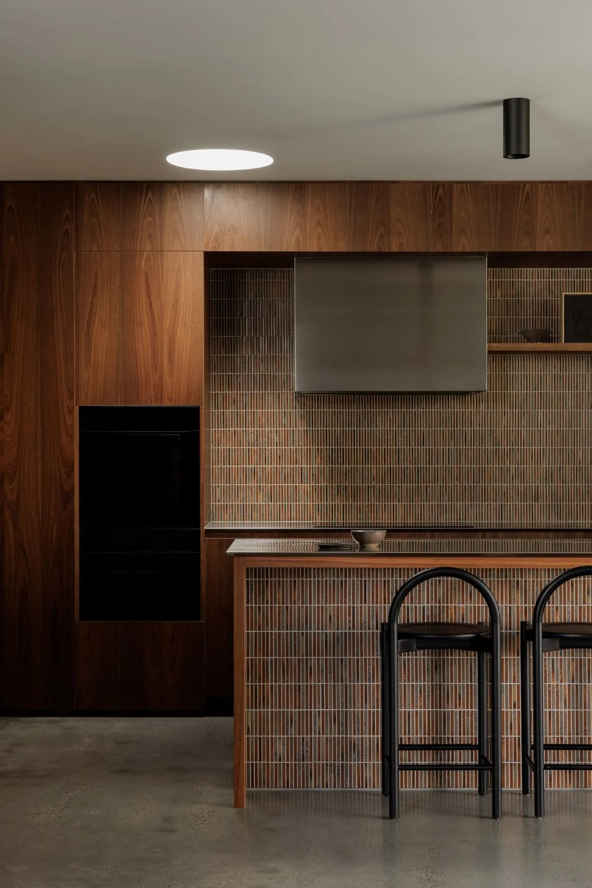
East End Treehouse by InForm.

Stainless bench + burgundy finger tiles

The Breakfast Club by Dyke and Dean
Short order, Australia by Mata Design
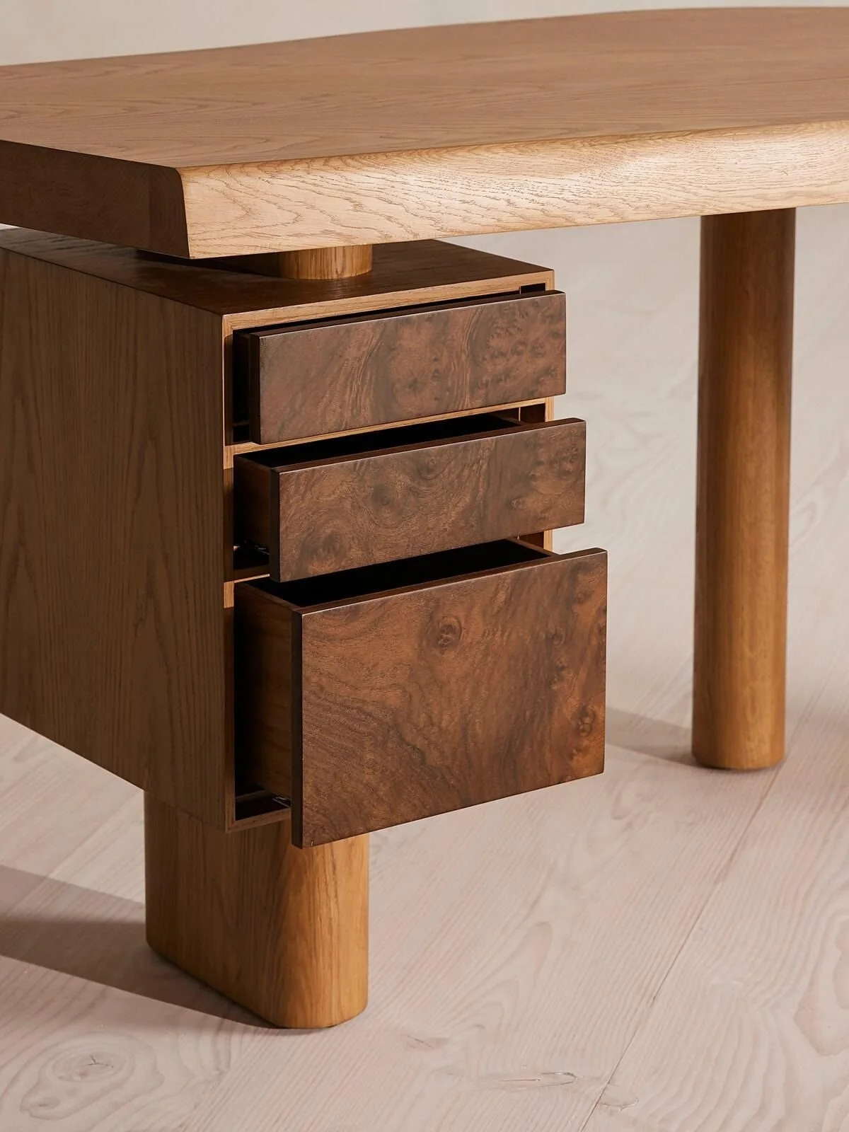
Arranmore Desk, Walnut Burl, Soho Home

By Shannon Wallack, LA